Keeping up with home design trends can be a fulfilling hobby, bringing fresh life and modernity to your home. However, don’t just blindly follow the latest trends–in fact, there are a lot of modern trends that are actually counterproductive, often bringing back interior design concepts that should have stayed in the past. To show you what we mean, here are some home design trends that will make your house look dated fast.
Edison Bulbs
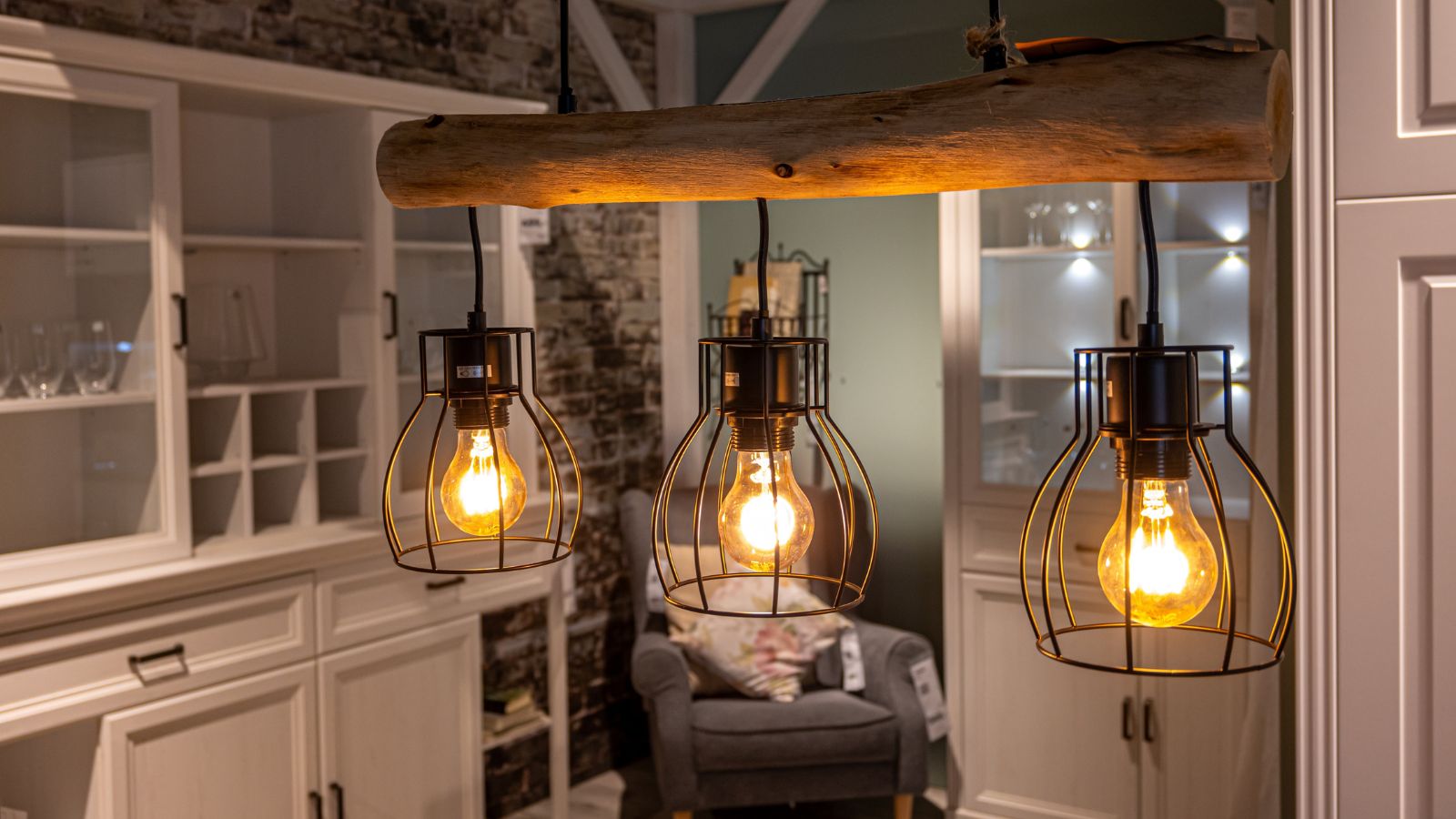
A couple of decades ago, Edison bulbs were a hip way to bring retro charm into a room, with people loving their exposed filaments. However, they’ve become a little too common. Furthermore, these bulbs often cast a yellow glow that doesn’t suit every setting, whereas modern light fixtures lean toward softer tones that don’t draw attention to themselves, letting other design elements take the spotlight.
Heavy Granite Countertops
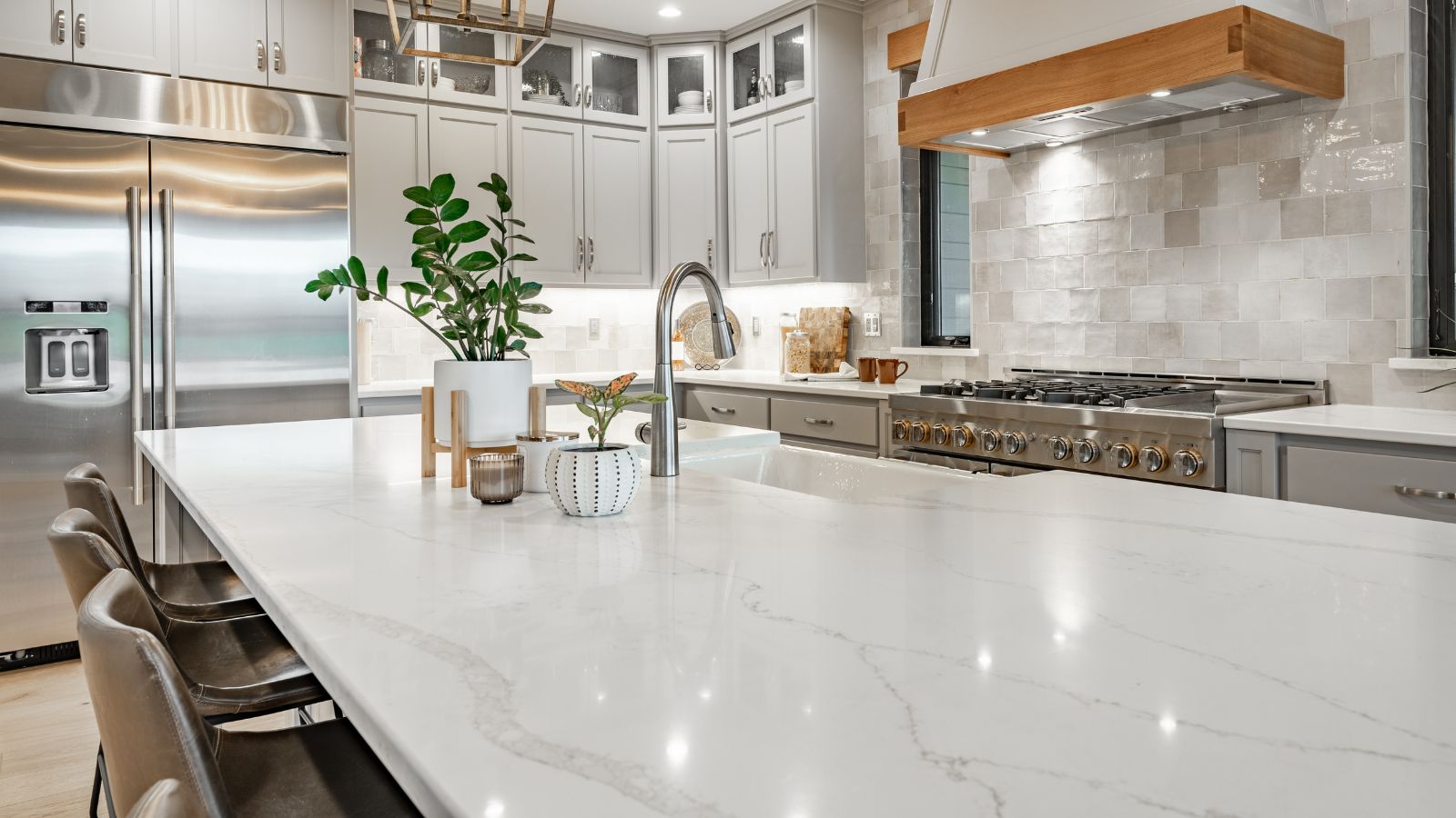
Even though granite once reigned supreme as the high-end countertop of choice, it’s quickly being replaced by lighter, sleeker surfaces. These days, marble and quartz have a more sophisticated edge, while granite’s bold, often busy patterns tend to overwhelm modern kitchens. Despite this, some people still use granite for their countertops, but it’s probably time that they had an upgrade.
Tuscan-Style Kitchens
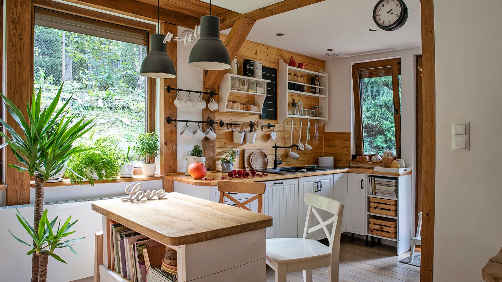
The warm, earthy tones of Tuscan paired with heavy cabinetry and ornate accents might evoke vibes of the Italian countryside, but to be honest, they also make kitchens feel dated. The rustic textures and intense colors often weigh down the space, so it’s better to consider fresher alternatives, such as minimalistic designs with clean lines and neutral colors.
Overly Dark Wood Finishes
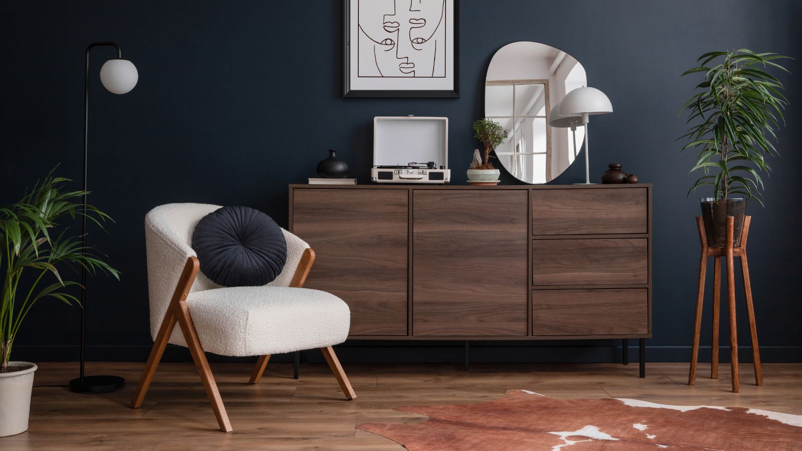
Not so long ago, dark wood floors, cabinets, and furniture symbolized luxury and elegance, yet these heavy hues have started to lose their charm. Most contemporary people prefer light, natural finishes that brighten rooms and add a modern, Scandinavian touch. Meanwhile, dark wood often absorbs too much light, leaving spaces feeling smaller and closed off.
Wall-to-Wall Carpeting
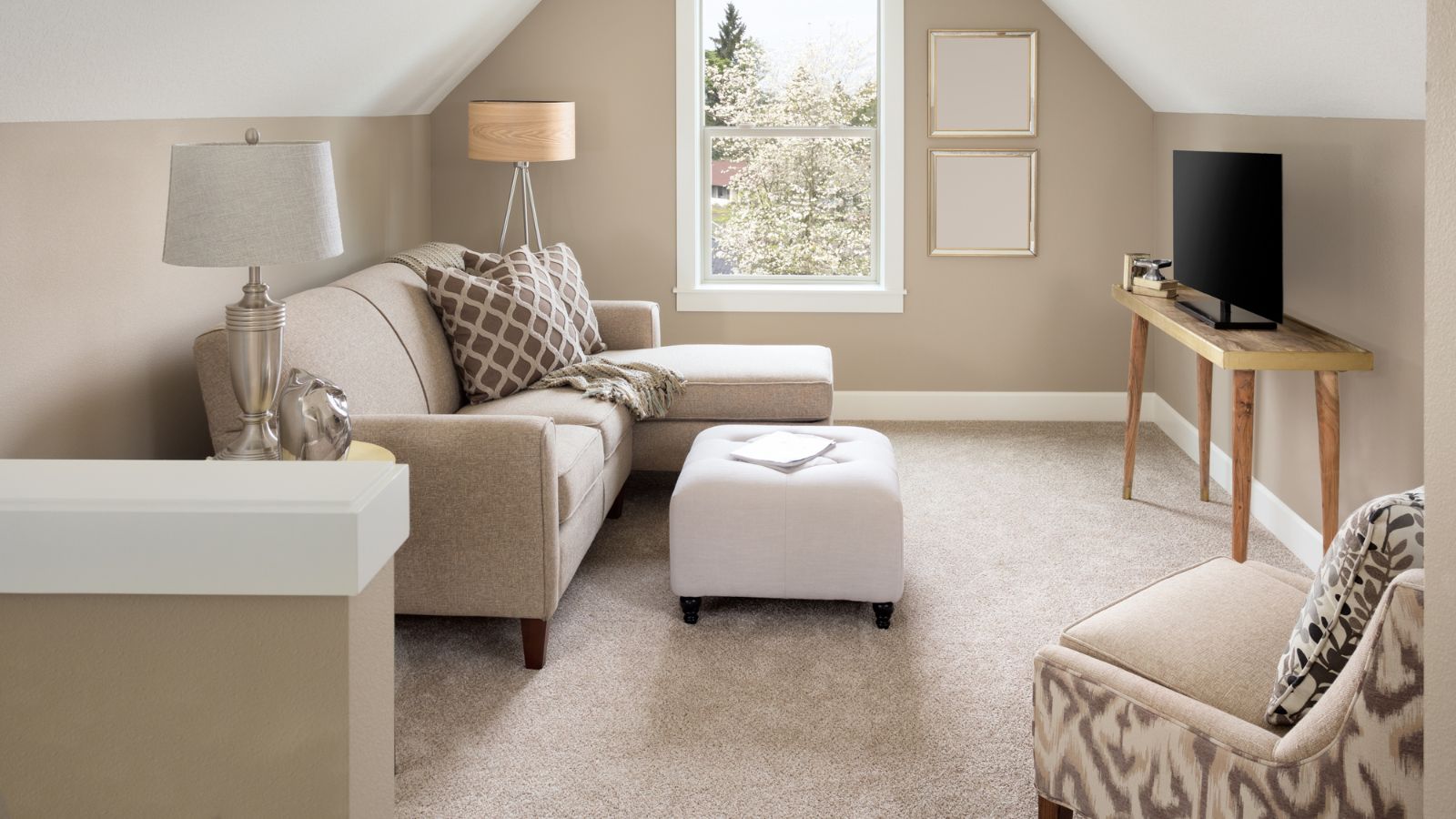
Before the 21st century began, wall-to-wall carpeting felt like a home essential, but it’s now more synonymous with older homes than current trends. Not only can it look worn quickly, but it also traps dust and stains. Hardwood, tile, and even polished concrete create a modern foundation and offer versatile, low-maintenance options that suit almost any aesthetic.
Patterned Wallpaper Borders
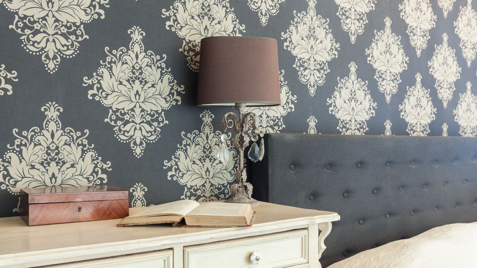
Wallpaper borders were a staple in 1990s interiors, often adding a “finished” look to rooms. Somehow, they’re starting to come back these days, but they’re generally considered unnecessary clutter that chops up wall space, interrupting clean lines. Modern walls are all about fluidity and a seamless look, with full-wall accent papers or neutral tones taking precedence over decorative borders.
Open Shelving Overload
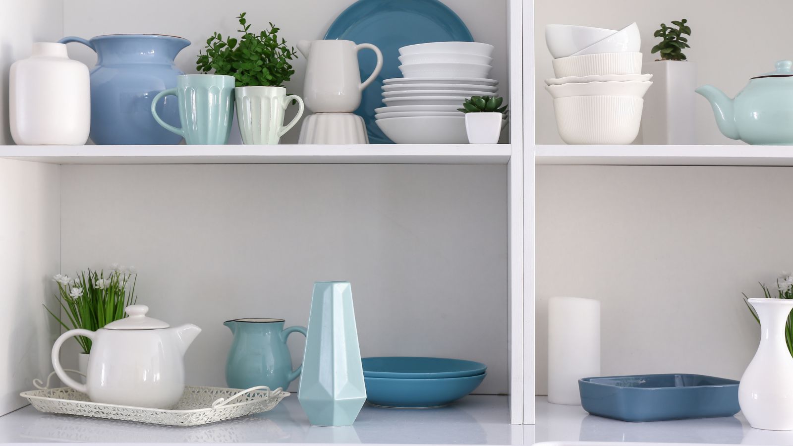
While a few open shelves offer a charming way to display beautiful dishware, entire walls of open shelving can make a kitchen look cluttered. Due to today’s focus on minimalism, this trend is starting to feel impractical and chaotic, especially when mismatched items accumulate. On the other hand, closed cabinetry creates a tidy, unified look, hiding away the everyday items that don’t belong on display.
Barn Doors in Every Room
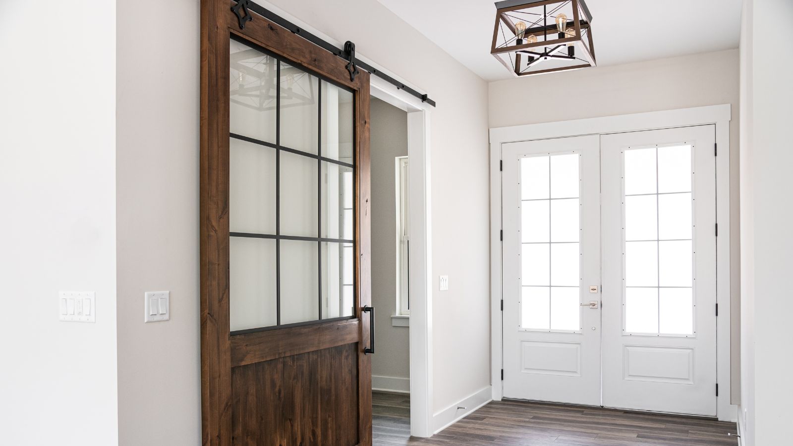
Here in the U.S., barn doors add an undeniably rustic charm, but they’ve become overused, especially in homes far from a farmhouse setting. These sliding doors often clash with contemporary decor, and their bulky hardware can be an eyesore. It’s much more modern to just go with standard doors, especially those with unique paneling or glass inserts.
Faux Distressed Furniture
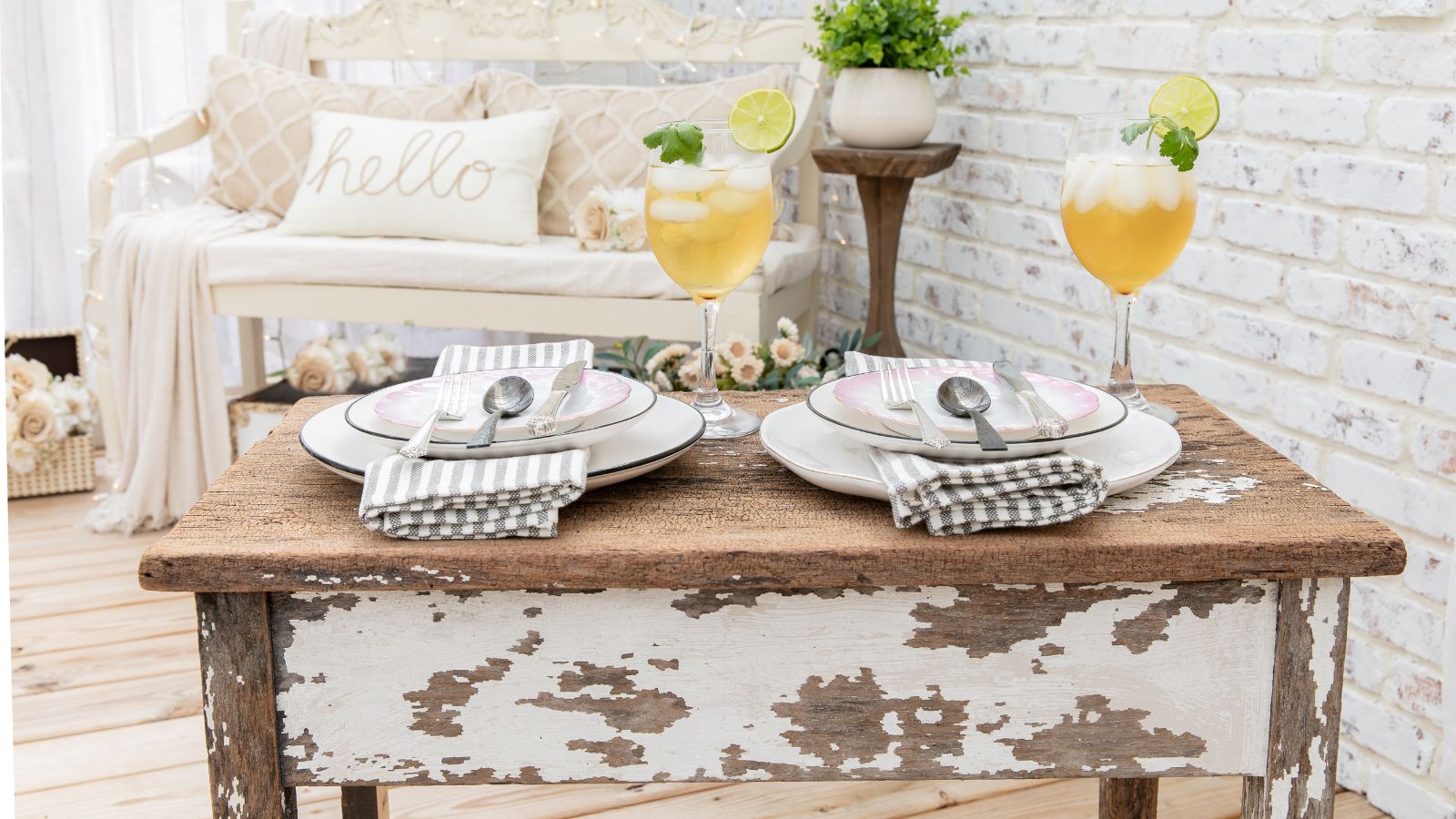
While bizarre, distressed furniture admittedly had its moment, bringing a vintage feel to new pieces. However, that’s long gone–the faux-worn look can now feel forced and artificial. Smooth, polished finishes are back, reflecting a preference for authenticity. On the other hand, genuine antique pieces retain a timeless appeal, while artificially aged items feel like a passing trend.
Industrial Pipe Shelving
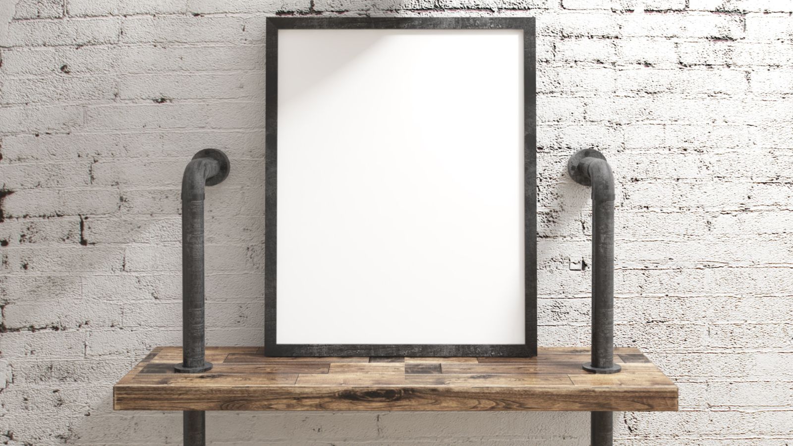
Can we all agree that industrial pipe shelving has overstayed its welcome, especially in homes where it feels out of place? The raw, unfinished look of exposed piping just seems overly harsh and disrupts the balance of softer decor elements. Just use modern shelving solutions, which are far more streamlined and blend in without demanding all the attention in a room.
Chevron and Moroccan Patterns
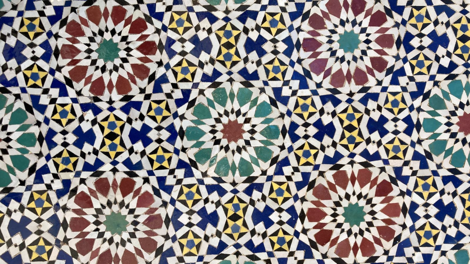
Chevron and Moroccan trellis patterns used to offer a bold visual punch to our homes, but as with many trends on this list, overuse in rugs, curtains, and upholstery has dulled their impact. In fact, they now feel repetitive and overly familiar, replaced by more subtle, organic textures. Designs inspired by nature, like leaf motifs and woven textures, feel more timeless.
Overstuffed Sectional Sofas
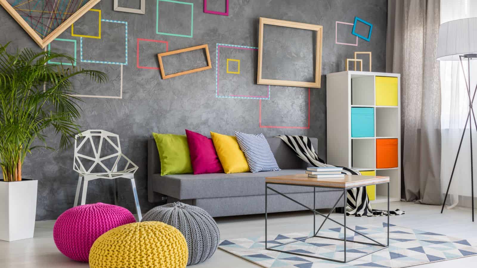
Large, plush sectional sofas used to be a symbol of comfort, but realistically, their size tends to overwhelm a living room and look outdated. Sleeker, modular sofas that fit the room’s proportions are now preferred, giving a more tailored look and helping the room to feel more open.
Overly White Kitchens
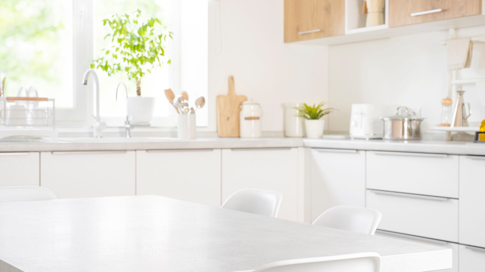
There was something about all-white kitchens that once represented cleanliness and minimalism, but nowadays, they’re beginning to feel sterile and lifeless–not to mention how much of a nightmare they are to clean. Mixing in natural wood elements, colored cabinetry, or patterned backsplashes adds far more warmth and personality. While white has its place, balanced contrasts make kitchens feel inviting rather than overly clinical.
Vertical Blinds
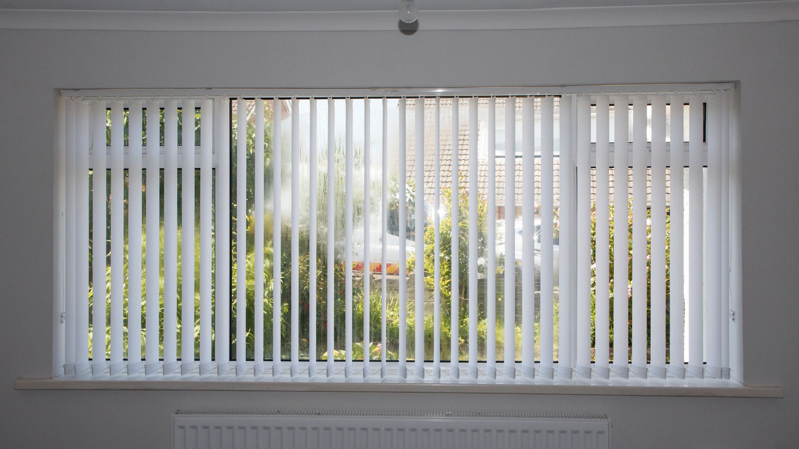
Another home design trend that will make your house look dated is vertical blinds, which are undeniably practical but have a stiff and utilitarian feel. In contrast, softer window treatments like sheer curtains or Roman shades create a cozier ambiance while still offering privacy. Today’s homes favor styles that let in natural light without the clunky look of thick plastic or vinyl slats.
Faux Plants Everywhere
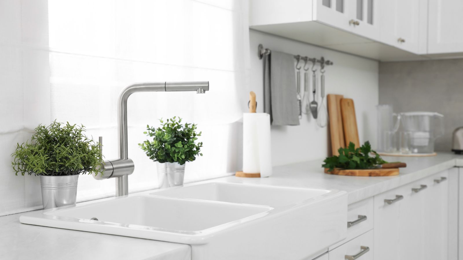
Back in the day, faux plants were an easy fix for a green, lively touch indoors, yet the charm wears off when they start to dominate spaces. With so many natural plant options suited for low light and low maintenance, there’s simply no need to rely on fake greenery. Real plants bring vibrancy, freshness, and health benefits that artificial ones completely lack.
Word Art and Quotes on Walls
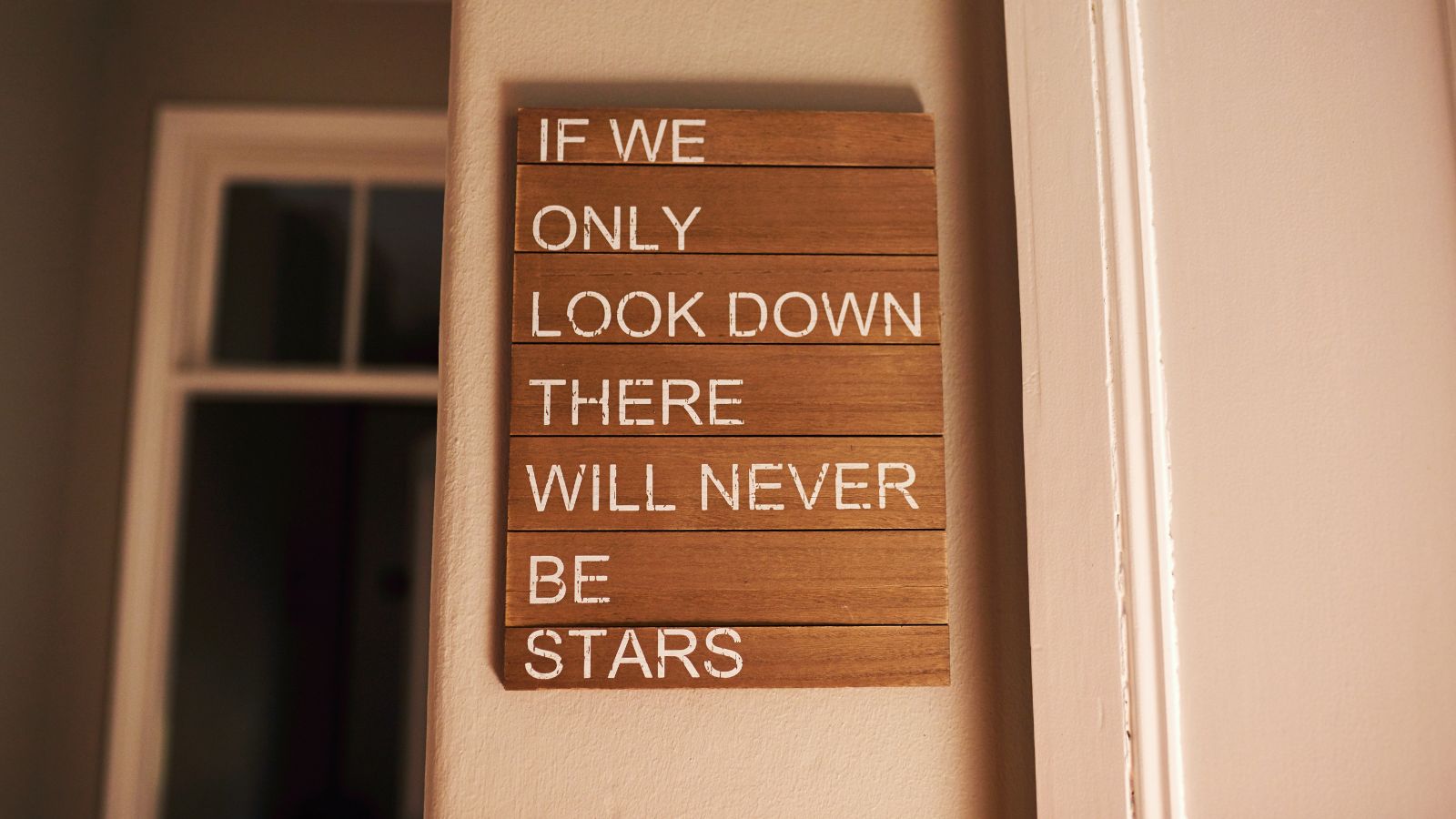
Only a decade ago, every house seemed to feature decorative wall quotes, a fun way to personalize a home. However, they’ve started to feel clichéd, with their inspirational phrases losing meaning, especially when they’re everywhere. Instead, homeowners are starting to choose unique artwork or photography that adds personal style without dictating the mood in words, so maybe you should consider doing the same.
Excessive Shiplap
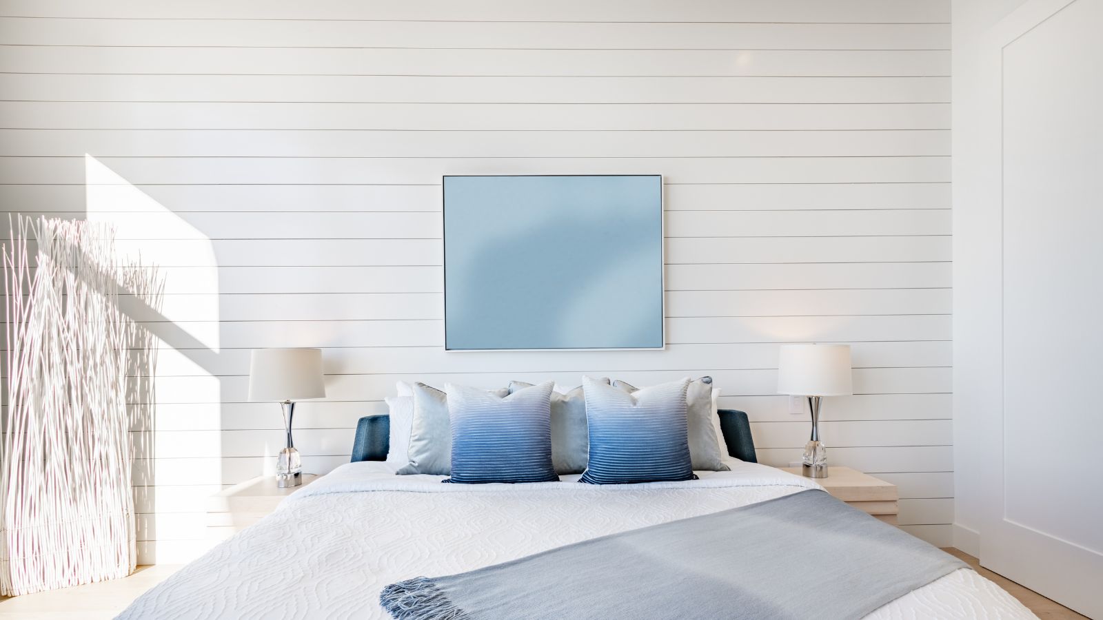
Shiplap walls were popularized by farmhouse-style trends, but when used in excess, they make homes feel stuck in a narrow aesthetic. This wooden paneling has limited versatility and doesn’t suit every space. Meanwhile, minimalistic wall treatments and textured paints are refreshing alternatives, offering a modern twist without the “farmhouse” vibe.
Matching Furniture Sets
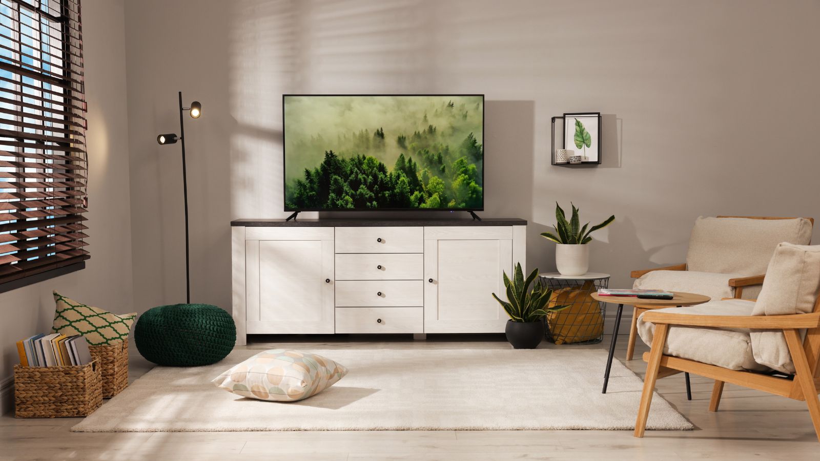
Last but perhaps most important on this list is matching furniture sets. Yes, there’s something convenient about buying matching furniture sets, but people are starting to realize that it actually tends to make a space look too uniform and uninspired. Initially, it might look messy, but with some thought put into it, mixing different pieces and materials gives a more collected, curated appearance that feels unique to each home.
